
Calculating rooftop solar savings in volatile electricity markets
A practical case study using German market data


Europe has seen extremely volatile electricity prices in recent years, with Germany standing out as one of the most affected countries. Inspired by the work of energy analyst Julien Jomaux on his Substack, I decided to explore in detail how these hourly price fluctuations impact the return on investment (ROI) for rooftop solar PV systems.
I collaborated with Julien on the ideas presented in this article, and he has generously provided an introductory commentary:
The rise of solar capacity has been arguably the largest game changer in the electricity sector of recent years. This has been made possible by the fast declining cost of solar panels, as well as the extreme modularity of solar projects (from less than 1 kW to several hundreds of MW) and the possibility of fast deployment.
As solar has an obvious daily and seasonal pattern, electricity markets have been affected accordingly: abundant energy at midday from March to November causing prices to crash. This has led to the so-called solar cannibalization effect which has been accelerating since the end of the energy crisis. It is becoming increasingly crucial to consider this dynamic if we want to keep the decabonization of the power sector a reality.
Benedetto's post contributes to the knowledge diffusion of this important matter.
— Julien Jomaux
This analysis builds on the series of Python tutorials I’ve published on simulating rooftop PV production data and matching it with building load profiles. You can find the complete list of my Python tutorials here. In the examples that follow, I’ll assume you’re already familiar with:
Loading a building’s hourly electricity consumption data (in the variable
hourly_site_consumption)1Generating the hourly electricity production of a PV system using pvlib (in the variable
module_energy)2Analyzing these time series to see how much electricity is consumed on site vs. injected back into the grid3
For this post, I imagine an alternative scenario where our previously analyzed U.S. building is located in Germany—purely to work with German electricity price data.
As a first step, I downloaded hourly pricing data from the Ember platform. The data is sourced and cleaned from ENTSO-E, the European Network of Transmission System Operators for Electricity.
Here’s how the data is loaded and prepared:
import pandas as pd

electricity_price = pd.read_csv('data/germany-electricity-prices.csv')
# Convert datetime columns to datetime type
electricity_price['Datetime (Local)'] = pd.to_datetime(electricity_price['Datetime (Local)'])
# Extract only prices from 2024
electricity_price = electricity_price[electricity_price['Datetime (Local)'].dt.year == 2024]
# set datetime as index
electricity_price.set_index('Datetime (Local)', inplace=True)
# Get the price column and convert from EUR/MWh to EUR/kWh
electricity_price = electricity_price['Price (EUR/MWhe)'] / 1000
avg_electricity_price = electricity_price.mean()
Let’s start by visualizing the average daily price profile for each month of 2024. This will give us a quick look at how prices vary across hours:
import plotly.graph_objects as go
# Create a daily electricity price profile for the whole year
electricity_price_with_hour = electricity_price.copy()

# Convert to DataFrame if it's a Series
electricity_price_with_hour = electricity_price_with_hour.to_frame()

# The index is already a DatetimeIndex, so we can directly extract components
electricity_price_with_hour['hour'] = electricity_price_with_hour.index.hour
electricity_price_with_hour['date'] = electricity_price_with_hour.index.normalize().date

# Create a figure for monthly average electricity price profiles
fig = go.Figure()

# Extract month from the datetime index and create a new column
electricity_price_with_hour['month'] = electricity_price_with_hour.index.month

# Calculate the average price for each hour within each month
monthly_avg = electricity_price_with_hour.groupby(['month', 'hour'])[electricity_price.name].mean().reset_index()

# Get unique months
unique_months = sorted(monthly_avg['month'].unique())

# Add a trace for each month
import calendar
for month in unique_months:
    month_data = monthly_avg[monthly_avg['month'] == month]
    month_name = calendar.month_name[month]
    fig.add_trace(go.Scatter(
        x=month_data['hour'],
        y=month_data[electricity_price.name],
        mode='lines',
        name=month_name,
        line=dict(width=2)
    ))

fig.update_layout(
    title='Average Monthly Electricity Price Profiles',
    xaxis_title='Hour of Day',
    yaxis_title='Average Electricity Price (EUR/MWhe)',
    xaxis=dict(tickmode='linear', tick0=0, dtick=1),
    legend_title='Month'
)

fig.show()
Output

From this plot, we see a characteristic “duck curve”, where prices tend to dip during peak solar generation. This reflects Germany’s substantial solar penetration: as more PV capacity comes online, midday prices often drop (or even become negative), reducing the economic returns for newly added solar capacity.
Next, let’s combine this pricing data with our building’s load profile and a simulated rooftop PV system. We’ll assume:
A 1.7 MWp rooftop system (system_size = 1 700 kWp), consistent with some of my previous examples, where we found 1.7 MWp to be near the “optimal” size for this particular building.
An hourly production time series called
module_energy(kWh per panel per hour, from pvlib). In order to estimate this, you’ll need to use Germany’s weather data, which you can find on the German Meteorological Service website.A load profile
hourly_site_consumption(kWh per hour).
With these values, we can calculate onsite consumption, grid consumption, and grid injection:
system_size = 1700 #kWp
module_rated_power = 0.4 # kWp
panel_count = system_size / module_rated_power
# match the PV production to the consumption
pv_production = module_energy * panel_count / 1000  # convert from Wh to kWh
# calculate the grid consumption as the difference between the consumption and the production (but not less than 0)
grid_consumption = (hourly_site_consumption - pv_production).clip(lower=0)
# calculate self consumption (electricity that is consumed on site)
self_consumption = hourly_site_consumption - grid_consumption
# calculate grid injection (excess electricity injected into the grid)
grid_injection = pv_production - self_consumption
By matching the electricity flows and prices, we can now estimate the annual ROI of this PV system. The idea is to compare the return obtained using the average price, versus the actual hourly electricity prices. For this analysis, we’ll only consider the return coming from self-consumption, as the regulatory framework to receive compensation for injecting electricity into the grid with large PV systems is quite complex in Germany.
Let’s first estimate the annual economic returns considering the average electricity price:
total_return_fixed_price = self_consumption.sum() * avg_electricity_price

print(f'The total annual return, considering an average electricity price of {round(avg_electricity_price, 3)} EUR/kWh, is: {round(total_return_fixed_price)} EUR')
Now let’s calculate the annual return using the actual hourly price whenever the building is self-consuming electricity:
total_return_hourly_price = (self_consumption * electricity_price).sum()
print(f'The total annual return, considering the dynamic hourly electricity price, is: {round(total_return_hourly_price)} EUR')
Finally, compare the difference:
print(f"The annual return difference between the fixed and dynamic price is: {round(total_return_hourly_price - total_return_fixed_price)} EUR, {round((total_return_hourly_price - total_return_fixed_price) / total_return_fixed_price * 100, 2)}% of the fixed price return")Output

In the example run I performed, the system’s annual income was around 35% lower when considering real-time prices instead of a constant average. In monetary terms, that amounted to about 30k EUR less than expected. The reason is straightforward: the hours with the highest PV output often coincide with the lowest (or even negative) electricity prices, eroding the financial benefit of self-consumption.
Implications and Possible Solutions
So, are there any solutions to this, or is solar doomed as a technology?
The first and most obvious solution is energy storage: with battery costs decreasing and price volatility growing, coupling rooftop PV with battery storage becomes increasingly attractive. By shifting excess generation to higher-price hours, storage can recapture some of the lost economic value.
This LinkedIn post I saw a few days ago summarizes this quite well:

The other solution, which might have an even bigger scale given that it’s mostly based on software rather than hardware, is Demand-Side Flexibility: adjusting building operations to consume more energy during hours of high renewable generation.
To exemplify this last point, for the building we’re analyzing, let’s have a look at how the load might align with PV generation and hourly prices during a sample week in August, when the “duck curve” is quite pronounced.
First, let’s look at electricity prices and solar production:
# Compare load, generation and price for one week in August
august_start_date = pd.Timestamp('2024-08-01').date()
august_end_date = pd.Timestamp('2024-08-08').date()

# Filter data for the selected week
# Make sure all dataframes have the same index length
common_index = hourly_site_consumption.index.intersection(pv_production.index).intersection(electricity_price.index)

# Create mask for August week
august_mask = [(idx.date() >= august_start_date) & (idx.date() < august_end_date) for idx in common_index]
august_indices = common_index[august_mask]

# Create figure with secondary y-axis for August
from plotly.subplots import make_subplots

fig = make_subplots(specs=[[{"secondary_y": True}]])

# Add traces for load and generation on primary y-axis
fig.add_trace(
    go.Scatter(
        x=august_indices,
        y=pv_production.loc[august_indices],
        name='Solar Generation (kW)',
    ),
    secondary_y=False,
)

# Add trace for electricity price on secondary y-axis
fig.add_trace(
    go.Scatter(
        x=august_indices,
        y=electricity_price.loc[august_indices],
        name='Electricity Price ($/kWh)',
    ),
    secondary_y=True
)

fig.show()
Output

We can see how the two time series are almost perfectly inversely correlated. Whenever the sun is shining, the price is lowest. This means that there are some hours when this building could use loads of electricity that would either be offset by high on-site generation or purchased at very low cost.
Let’s have a look at how the building load relates to this:
# add electricity consumption timeseries
fig.add_trace(
    go.Scatter(x=august_indices, y=hourly_site_consumption.loc[august_indices], name='Building Load (kW)'),
    secondary_y=False
)
fig.show()
Output
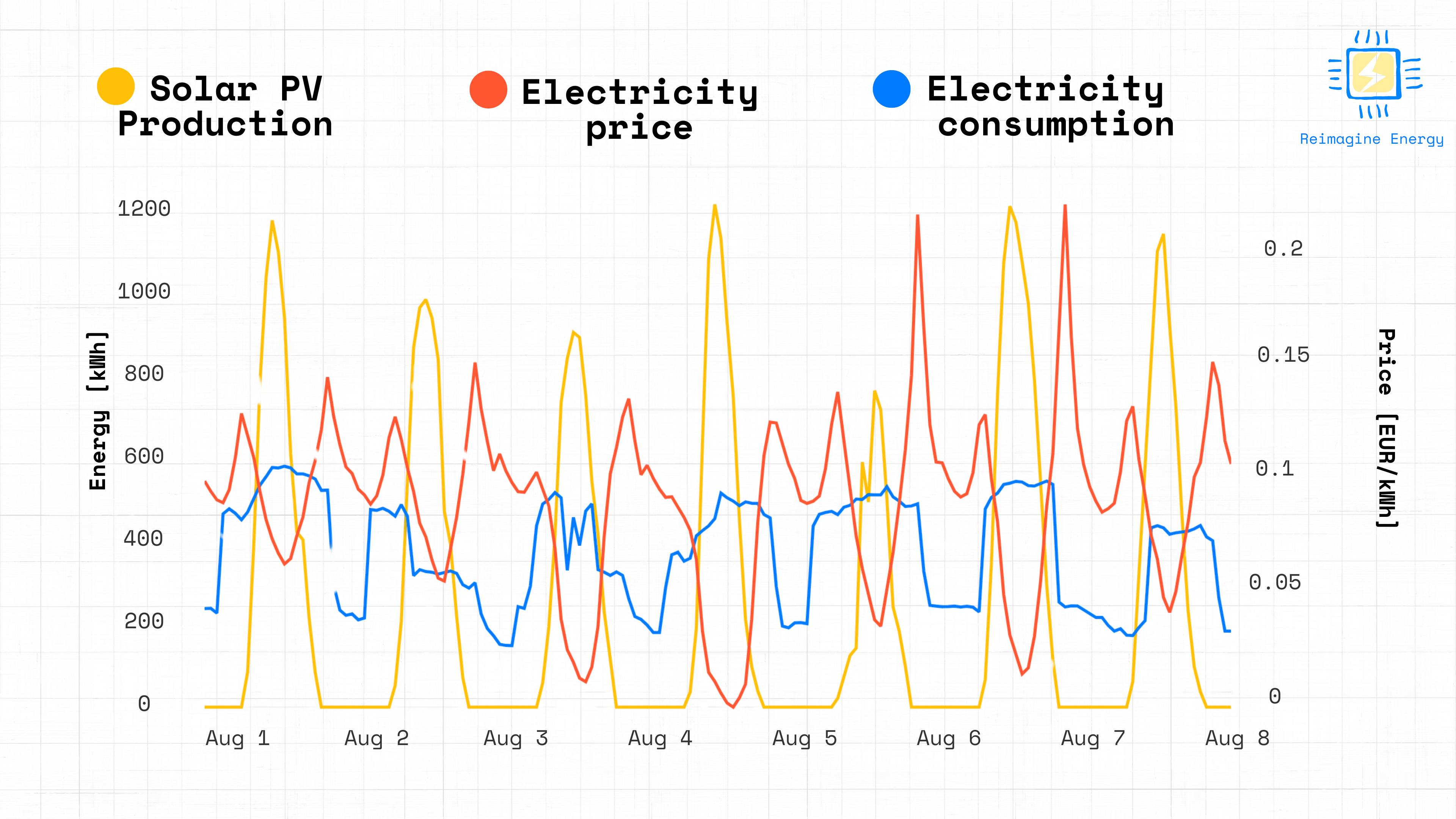
We can see that most building operations already take place during hours of high PV production, but there’s often room to fine-tune controls (while maintaining occupant comfort) to capture additional economic benefit. This could mean ramping up building operations slightly later, or even temporarily shutting down some of the equipment during the day, depending on the solar production and electricity price signals.
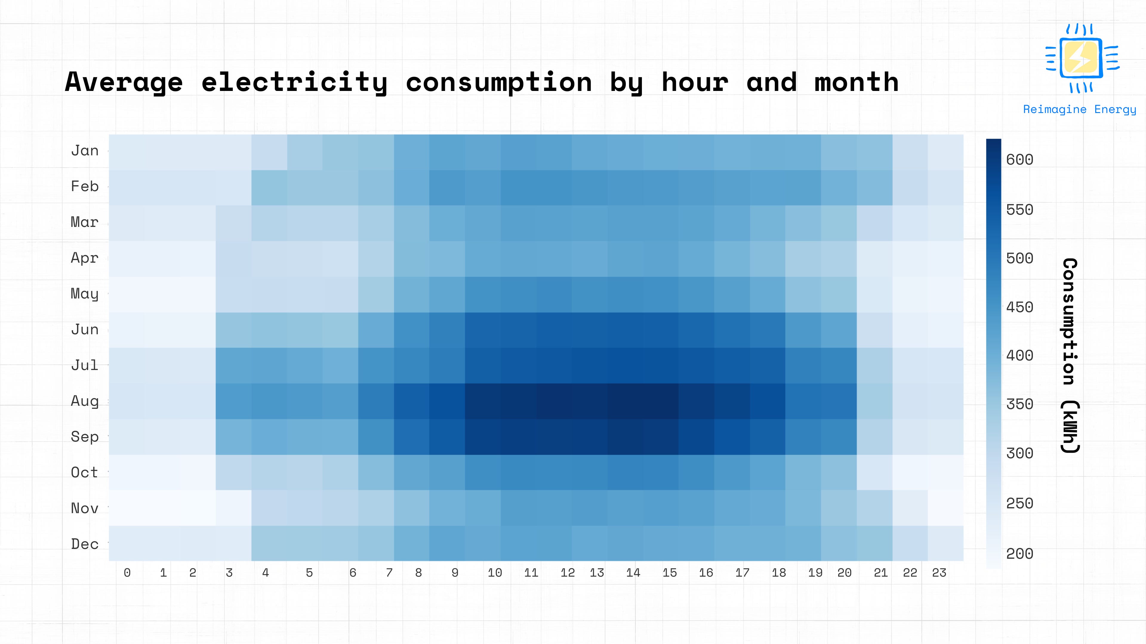
Heat maps are also really powerful at outlining this:
# generate heat maps for solar production, price, and consumption
# First, ensure all data series have the same length by aligning them
common_index = pv_production.index.intersection(electricity_price.index).intersection(electricity_price_with_hour.index)

# Reindex all series to the common index
pv_production_aligned = pv_production.loc[common_index]
electricity_price_aligned = electricity_price.loc[common_index]
electricity_price_with_hour_aligned = electricity_price_with_hour.loc[common_index]
hourly_site_consumption_aligned = hourly_site_consumption.loc[common_index]

heatmap_data = pd.DataFrame({
    'Solar Production (kWh)': pv_production_aligned,
    'Electricity Price (EUR/kWh)': electricity_price_aligned,
    'Consumption (kWh)': hourly_site_consumption_aligned,
    'Hour of Day': electricity_price_with_hour_aligned.index.hour
})

# Extract hour and month from the datetime index
heatmap_data['Hour'] = heatmap_data.index.hour
heatmap_data['Month'] = heatmap_data.index.month

# Create month names for better readability
month_names = {
    1: 'January', 2: 'February', 3: 'March', 4: 'April',
    5: 'May', 6: 'June', 7: 'July', 8: 'August',
    9: 'September', 10: 'October', 11: 'November', 12: 'December'
}
heatmap_data['Month_Name'] = heatmap_data['Month'].map(month_names)

# 1. Electricity Price Heatmap
price_pivot = heatmap_data.pivot_table(
    values='Electricity Price (EUR/kWh)',
    index='Month_Name',
    columns='Hour',
    aggfunc='mean'
)

# Reorder months chronologically
price_pivot = price_pivot.reindex([month_names[i] for i in range(1, 13)])

# Create the price heatmap
fig_price_heatmap = px.imshow(
    price_pivot,
    labels=dict(x="Hour of Day", y="Month", color="Avg. Price ($/kWh)"),
    x=[str(h) for h in range(24)],
    y=price_pivot.index,
    color_continuous_scale="Viridis"
)

fig_price_heatmap.update_layout(
    width=900,
    height=600,
    xaxis=dict(tickmode='linear')
)

fig_price_heatmap.show()

# 2. Solar Generation Heatmap

solar_pivot = heatmap_data.pivot_table(
        values='Solar Production (kWh)',
        index='Month_Name',
        columns='Hour',
        aggfunc='mean'
    )

# Reorder months chronologically
solar_pivot = solar_pivot.reindex([month_names[i] for i in range(1, 13)])

# Create the solar generation heatmap
fig_solar_heatmap = px.imshow(
        solar_pivot,
        labels=dict(x="Hour of Day", y="Month", color="Avg. Solar Production (kWh)"),
        x=[str(h) for h in range(24)],
        y=solar_pivot.index,
        color_continuous_scale="YlOrRd"
    )

fig_solar_heatmap.update_layout(
        width=900,
        height=600,
        xaxis=dict(tickmode='linear')
    )

fig_solar_heatmap.show()

# 3. Building Consumption Heatmap

consumption_pivot = heatmap_data.pivot_table(
            values='Consumption (kWh)',
            index='Month_Name',
            columns='Hour',
            aggfunc='mean'
        )

# Reorder months chronologically
consumption_pivot = consumption_pivot.reindex([month_names[i] for i in range(1, 13)])

# Create the consumption heatmap
fig_consumption_heatmap = px.imshow(
            consumption_pivot,
            labels=dict(x="Hour of Day", y="Month", color="Consumption (kWh)"),
            x=[str(h) for h in range(24)],
            y=consumption_pivot.index,
            title="Average Building Consumption by Hour and Month",
            color_continuous_scale="Blues"
        )

fig_consumption_heatmap.update_layout(
            width=900,
            height=600,
            xaxis=dict(tickmode='linear')
        )

fig_consumption_heatmap.show()
Output


The lowest electricity prices and highest PV production align quite well.
The building load analysis, on the other hand, shows that the consumption is driven by summer cooling, as the hours of highest consumption are in the middle of the day during the summer. Ideally we’d want to align that heat map as much as possible with the electricity price and solar generation maps, to have the lowest possible impact.
Conclusion
The German economy heavily relies on industry, and a stable, affordable power supply is essential for these industries to flourish. It’s no surprise, then, that the impact of renewables on Germany’s electricity prices, including events like the ‘Dunkelflaute’, has dominated public discussion in recent months, becoming one of the critical factors leading to the government’s collapse in December.
However, before the government fell, it managed to pass an energy reform4 aimed at tackling these issues, notably by promoting energy storage co-located with renewable energy sources. Two key points from this reform are:
No feed-in tariff will be paid to renewable energy producers during hours when electricity prices are negative.
It is now allowed to charge energy storage systems co-located with renewable assets—a practice previously prohibited by the so-called “exclusivity principle”.
It’s increasingly clear that renewables without accompanying energy storage or demand-side flexibility can disrupt electricity markets and networks. This isn’t surprising, considering it has already been an issue in California for more than ten years.
I’m curious to see what new business models will emerge from these European market conditions, especially when combined with data, advanced metering infrastructure, and AI-driven solutions.


https://dserver.bundestag.de/btd/20/142/2014235.pdf
 | A guest post by
|
Great post!
The next question in your series (which I am helping a German relative figure out out of intelectual curiosity) is: assuming very low or zero feed in tariff, what size battery is the best economically.
With falling battery costs (for households I bought at 280€/kWh), moving from 1 to 2 or even 4h battery systems start making sense.
Great post, thanks! You can also calculate the changes in ROI of solar, onshore wind and offshore wind as categories by looking at the market value data that the TSOs in Germany are obliged to publish: https://www.netztransparenz.de/en/Renewable-energies-and-levies/EEG/Transparency-requirements/Market-premium/Market-value-overview
The calculation method is the same that you're using. Data goes back to 2012 – things really were different back then